Intro
A few months ago I came across an excellent post by Zeke at Lucia’s Blackboard: http://rankexploits.com/musings/2010/uhi-in-the-u-s-a/
One thing that wasn’t directly explored in the post itself was how changes in population densities affect temperatures. Rather, there were comparisons of urban to rural trends, and comparisons based on the population densities in the last years, but not the actual change in population densities. Theoretically, if the population density around each station grew at the same rate, and this contributed to the warming at the same rate, comparing different stations would show no difference in temperature trends (and hence no UHI) even though a UHI effect is present.
I was considering taking this up as a project, but I was busy with other things, had never done anything related to these temperature datasets, and saw Zeke actually had a comment (#38553) where he mentioned he was looking into this. I figured I’d just wait for his results.
Well, recently I was curious and decided I should just get off my lazy butt and do it myself. I have a bit of familiarity with Java, but R is completely new to me (as you’ll be able to see).
***Disclaimer: I want to mention that I am trying to find a UHI signal here, and I’m not a statistician, so you can judge if some methods are overstepping any bounds and cherry-picking or finding spurious correlations.
Relevant Links:
Intermediate data and code is available HERE.
Original USHCN data is available at ftp://ftp.ncdc.noaa.gov/pub/data/ushcn/v2/monthly/
Original GWPv3 data is available at http://sedac.ciesin.columbia.edu/gpw/global.jsp
Determining significance http://faculty.vassar.edu/lowry/ch4apx.html
Endpoint temperature difference vs. endpoint population density difference
The only period I’m examining here is from 1990 to 2000, because according to the GPW3_GRUMP summary information, those seem to be the only two years of actual population data available for the U.S. It looks like other years are simply estimated based on extrapolation.
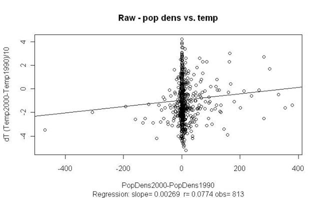
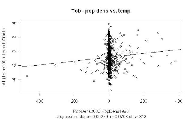
Anyhow, my first attempt approach was a simple one – I plotted the difference between station temperatures from 1990 to 2000 (based on yearly averages) vs. the difference in population densities from 1990 to 2000.
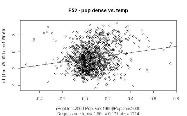
I thus only include stations that have data for both population density and yearly average temperature in 1990 and 2000. You’ll notice that the F52 plots have more stations because it extrapolates yearly average temperature data even when it is unavailable in the raw dataset. Anyhow, here we go:
There’s something there, but removing those outliers in the -200 region and beyond actually make the r value worse.
The dT is the trend per year, but in the temp data 6.47 is actually stored as 647, so our scale is hundredths of a degree per year the scale is tenths of a degree F. So if we’re to believe our slope from the F52 plot above, increasing the population density of a town by 50 people per km would result in a (50 * .002) / 100 = .001 degrees/year trend, or .01 degrees/decade trend 0.1 degrees F / decade trend.
Endpoint temperature difference vs. endpoint population difference as a percentage of end year population density
Of course, we may expect the heating effect of increasing population density to diminish as we get a higher population density, so we’ll divide that population difference by the end year density. After all, going from 1 to 51 people per km would seem to affect the UHI more than going from 150 to 200 people per km.
Better r values, and I think the method is still defensible. If we believe the slope from F52 above, then we would expect that if 50% of our population density in a town has come within the last decade, it has contributed (0.5 * 1.86) / 100 * 10 = 0.093 degrees 0.93 degrees F to that decade trend.
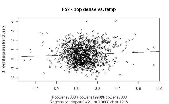
Linear temperature trend vs. endpoint population difference as a percentage
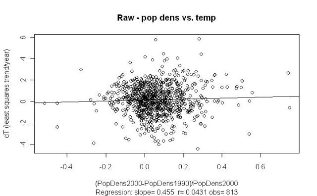
I implemented a simple least squares regression in Java to calculate the linear trend per year of temperature, since we have more data points than just the two end-points for that (unlike population density). I then used this as the Y value to plot against the population density difference:
I show two examples above because the F52 seems particularly sensitive to the outlier. If we’re to believe this last slope, then we would expect that if 50% of our population density in a town has come within the last decade, it has contributed (0.5 * .421) / 100 * 10 = 0.021 0.21 degrees F to that decade trend.
However, I’m a bit surprised by these last results (when using the OLS trend for the Y-value), and why the r values are considerably smaller than when simply using endpoint differences in temperature. I’m tempted to move on analyze different population densities (<10, >10 & < 100, > 100, etc.) using simply the endpoint temperature differences, but I’m not sure why theoretically this would be a better approach than using those OLS trends.
Is it incorrect to use those 9 in-between years of temperature data, when they are not available for population density? I could make the argument that if there was a population boom in the last year of a town, and this contributed considerably to the warming, that the endpoint difference would capture this better than the OLS trend, but can situations like these really account for such a difference across all the stations?
Update (8/8): It pays to read the README.txt file. Apparently the reported temperatures are in tenths of degrees Fahrenheit, not hundredths of a degree Celsius.




Interesting work. I got similar charts when I tried the analysis, but gave them up as too noisy to get much out of. I’m still trying to track down some usable population density data for the U.S. pre-1990, as a 10-year period is a bit smaller then ideal to work with.
Comment by Zeke — August 6, 2010 @ 5:17 pm
I agree with you that having simply the two years for population density (1990 and 2000) is unfortunate. I may try going over some other countries using the global temperature data, but I’ll need to see per country how good that population density data is. Still, having some pre-1990 data would be ideal.
Using the 2nd approach from above, and breaking it down by 2000 population density, I’m able to get a little stronger signal. I’ll write that up in a post (hopefully) soon here.
Comment by troyca — August 6, 2010 @ 3:24 pm
[…] Troy_CA's blog Troy_CA's blog Skip to content HomeAbout ← Searching for UHI in changing population densities in the United States […]
Pingback by Searching for UHI in changing population densities in the US part 2 | Troy_CA's blog — August 6, 2010 @ 5:24 pm
[…] in GHCN Posted on August 30, 2010 by troyca Continuing on what I’ve been doing in Part I and Part II of my U.S. analysis in terms of UHI as a function of population, I’ll now look at […]
Pingback by More UHI sniffing in GHCN | Troy_CA's blog — August 30, 2010 @ 10:25 pm
[…] in population density from 1990 to 2000 and the change in temps from 1990 to 2000 in the US. See here, here, and here. At first I took this to be a UHI signal. However, a bit more investigating has […]
Pingback by Explaining correlation in US UHI tests | Troy_CA's blog — November 4, 2010 @ 1:04 pm