Troy's Scratchpad

August 30, 2010

More UHI sniffing in GHCN

Filed under: Uncategorized — troyca @ 10:25 pm

Continuing on what I’ve been doing in Part I and Part II of my U.S. analysis in terms of UHI as a function of population, I’ll now look at the global temperature dataset.
The GHCN data can be retrieved from here: ftp://ftp.ncdc.noaa.gov/pub/data/ghcn/v2

I used the MEAN_ADJ data for all of my analysis.

Code and relevant data for this post can be found here: http://dl.dropbox.com/u/9160367/8-30-PostUHI.zip

The first attempt I made was to proceed almost exactly with GHCN as I had with USHCN. There are some subtle changes in the formatting that made me modify the algorithm slightly for the “global” format, the biggest being that I needed to calculate the yearly average from the monthly data rather than having it provided.  Also, some of the subsets below were manually processed in Excel (to remove US stations).

NOTE: the GHCN temps are reported in tenths of a degree Celsius, rather than Fahrenheit.With the first chart we get something like this (from dataset A):

Does this mean we have an independent confirmation at the global level of the phenomenon found in the United States?  Umm, no.  A closer look at the dataset reveals that out of the 771 stations included in this subset of “valid” station data, only 42 lie outside of the United States!  So of course we’re going to see something similar to the USHCN if most of these valid stations are the same.

I thus changed what data was considered “valid”.  My original requirement was as follows – I needed to have valid year averages available for 1990 and 2000, to use the endpoint temp comparison method.   I only got a “valid” year average if every month reported over the course of the year.  It may be amazing, but from that GHCN dataset, only those 42 stations seem to report for all twelve months in 1990 AND all twelve months in 2000.

So, I lowered the requirement to where I would only calculate the average for a year from months  1, 4, 7, and 10.  Not perfect, but this gives a sampling from all seasons.  It means that stations will only need to report for a specific 8 months instead of the whole 24 months in order to be considered valid.  This result is dataset B.
The number of non-US stations by about 30% to 55:

The next recourse was thus to relax the requirement for having data in both 1990 and 2000.  This eliminated the option of using the “end-point” method, so I needed to use the “OLS trend” method.  To ensure a fair sampling one of the requirements was that at least 4 years needed to report between 1990 and 2000 (still using the 4 month average for the year temp), rather than exactly 1990 and 2000 needing to report.

This is the resulting dataset (C) with only the non-US portion:

So do we have further proof of the UHI effect on the global scale?  Once again, unfortunately not.

The following is our “global” station breakdown by country in those 115 obs:

REPUBLIC OF KOREA: 56

AUSTRALIA: 37

NEW ZEALAND, SPAIN: 4

JAPAN: 2

EGYPT, SOUTH AFRICA, REUNION ISLAND (FRANCE), INDIA, ARGENTINA, GREENLAND, PUERTO RICO (U.S.A.), AMERICAN SAMOA (U.S.A.) , FEDERATED STATES OF MICRONESIA, DENMARK,  GERMANY, ICELAND: 1

As you can see, the set is dominated by Korea, which greatly affects our resulting trend but in reality does not make up a large portion of the earth.

At this point, I could bemoan the lack of quality stations in the GHCN dataset from 1990 to 2000, but rumor has it some other citizen scientists have been working on another dataset.  I hope to make use of this in the near future to continue investigating this at the global level…

August 10, 2010

Specific Humidity, Temperature, and UHI

Filed under: Uncategorized — troyca @ 11:37 am

Over at Open Mind, Tamino finds something pretty cool: when you superimpose the scaled GISSTemp anamolies over the specific humidity anomlies, they track pretty well.  From his comment,  

It also raises a question for those who doubt the correctness of observed global temperature increase: if (as so many denialists claim) the globe isn’t warming because the global temperature estimates are wrong, then why does the specific humidity track it so well?

I get the impression that he’s implying (I could be reading too much into this) that there is no major issue with the temperature record — such as a UHI bias.  Maybe I’m just being obtuse here because I don’t want to think I’ve been on a fool’s errand trying to find a UHI signal , but I don’t see how the superimposition necessarily suggests that there’s no UHI bias in the record.  After all, he’s scaled the GISSTemp, so we could theoretically scale to a different value if we predicted a different degree of warming.

First, I’ll try to re-create his graph.  I’m using specific humidity data (B&K) from here, and GISSTemp data from here

I think that looks about right.  I scale based on the ratio of the specific humidity trend vs. GISSTemp trend (here it ends up being 0.003697), and use the 1980 value as my temperature baseline value (27). to calculate temperature anamolies.  The result is the graph above, with a correlation of 0.89.

Now, suppose we assumed that the 40% of the warming trend in GISSTemp over this time period is actually the result of a UHI bias.  I correct for this by subtracting SLOPE * 0.4 * YEARS_SINCE_1970 from all of the relevant GISSTemp points.  Let’s see if we can superimpose it again:

Here my scaling value is 0.006162, my baseline temp value is 19.17, and the correlation is 0.88.

Is it suprising to see that even if there was a large (40%)  UHI bias in the GISSTemp record, it would still track well?  That is, even if we assume that true global warming has been only a bit more than half of what’s shown in GISSTemp, we can still get a match to this specific humidity?  It shouldn’t be, since once again, we’re simply scaling the GISSTemp record. 

Now, it may be that a temperature increase of X predicts a specific rise in humidity of Y, in which case we can’t just change our scale willy-nilly.  However, I did not see those specific calculations at first glance. 

Furthermore, one may object that the UHI bias would not be quite as constant as we used it, where we basically assumed exactly an increase of 40% of the overall trend per year. 

Still, for the sake of completeness, I wanted to show that the tracking in itself does not necessarily vindicate the magnitude of warming in the record…not when we use scaling.

August 6, 2010

Searching for UHI in changing population densities in the US part 2

Filed under: Uncategorized — troyca @ 5:24 pm

In my last post, I did some preliminary analysis of the relationship between population density and temperature.  You can find links to the code and data in that post.  I tried to make the code reader-friendly and flexible so I’d encourage anyone to take it and run their own tests with it.

Anyhow, in that post the largest correlation occurs when comparing: endpoint (1990 and 2000) temperature differences vs. endpoint population difference as a percentage of end year population density.  While I’m not certain that theoretically this is a better approach than using the linear temperature trend from 1990 to 2000 as my y-value, I’ll proceed with this method because that’s where the signal (or spurious correlation) seems to appear.  I’ll break it down by 2000 population density and we can get a hint about how the trends may differ in rural, city, and big city situations (I hope Zeke won’t mind me borrowing his idea yet again and using 10 and 100 breakdowns).   

Low density stations (PopDens2000  <  10)

There are four values on the extremes of the X-axis (large relative changes in population density) that have a significant effect on the trend and correlation here.  If I exclude those four observations (include only X > -.4 & X < .6), we get an even better correlation:

Medium density stations (PopDens2000 > 10  & PopDens2000 < 100)

High density stations (PopDens2000 > 100)

As was the case with low density areas, the trend and correlation seem to be greatly affected by a few points on the extremes of the relative population change axis.  If I filter these out (include only X > -.25 & X < .4), I get a much better correlation below.

Impressions

I would say we’re getting a significant signal in the low density (PopDens < 10) and high density (PopDens > 100) situations.  What’s more, this signal seems to appear just as strong (if not stronger) in the F52 case, which I understand is supposed to correct for UHI.  I don’t believe the adjustments are necessarily making the UHI effect worse, but rather that many of the corrections in the F52 data are useful and probably just help make the signal clearer.  However, my impression is that these corrections fail to remove the UHI effect.

Another thing the results show is that comparing rural to urban stations may not be the way to detect UHI, since the low density stations and high density stations are both affected.  This means that the TOB adjustment issue for rural stations may be a red herring.

Of course, this all comes with the caveat that we only have a small time period of population data to work with here, and my approach is somewhat questionable.

Quantifying the Effect

Here’s my little back-of-the-napkin approach for quantifying the effect of UHI between 1990 and 2000 based on the results.  If someone is so inclined they can do a more correct analysis by running the code from Clear Climate Code or another temperature  reconstruction, but with all the uncertainties here already present I don’t know that such a level of precision is warranted.

First, I calc the mean relative population density change between 1990 and 2000 (mean of X-axis values from F52 charts above) using R:

Mean at PopDens2000 < 10: 0.05827

Mean at PopDens2000 > 10 & < 100: 0.073120

Mean at PopDens2000 > 100: 0.05912

I then multiply these values by their respective slopes, and take a weighted average based on the number of observations (stations).  (Remembers that the slope is hundredths tenths of a degree (F) per year, to we need to divide by 10 to get degrees per decade).  The quick and dirty approach yields:

[(.05827 * 3.2 * 387) + (0.073120 * 1 * 432) + (0.05912 * 2.68 * 383)] / (387 + 432 + 383) / 10 = .0137 C / decade 0.137 degrees F / decade, or .076 degrees C / decade.

Since we’ve only considered data from 1990 to 2000, we may want to only look at the average US trend during that time.  Once again I’ll take a quick-and-dirty approach of simply averaging all of my F52 station data together each year between 1990 and 2000, and then calculating the 10 year trend using OLS.

My years look like this:

1990    540.1651602

1991    536.7764996

1992    527.2547247

1993    515.9013969

1994    530.0986031

1995    528.7929334

1996    519.1618735

1997    524.4864421

1998    548.5152013

1999    541.8685292

2000    532.8077239

The calculated slope is .487 hundredths tenths of a degree per year, or .0487 C / decade. 0.487 degrees F / decade, or .271 degrees C / decade.

If we take this at face value, it would suggest that UHI accounts for 28% of the warming of the 1990 to 2000 time period.  However, if you look at the years above, the trend in the U.S. is lower in part because we have a peak in 1990, and so I would venture to say that this 28% is an overestimate.

My next step will likely be to run similar experiments, but with global data, and see if I get similar results.

Update (8/8): As in the last post, I should have read the README file more carefully.  The reported temperatures are in tenths of degrees Fahrenheit, not hundredths of a degree Celsius.

Searching for UHI in changing population densities in the United States

Filed under: Uncategorized — troyca @ 2:16 am

Intro

A few months ago I came across an excellent post by Zeke at Lucia’s Blackboard: http://rankexploits.com/musings/2010/uhi-in-the-u-s-a/

One thing that wasn’t directly explored in the post itself was how changes in population densities affect temperatures. Rather, there were comparisons of urban to rural trends, and comparisons based on the population densities in the last years, but not the actual change in population densities. Theoretically, if the population density around each station grew at the same rate, and this contributed to the warming at the same rate, comparing different stations would show no difference in temperature trends (and hence no UHI) even though a UHI effect is present.

I was considering taking this up as a project, but I was busy with other things, had never done anything related to these temperature datasets, and saw Zeke actually had a comment (#38553) where he mentioned he was looking into this. I figured I’d just wait for his results.

Well, recently I was curious and decided I should just get off my lazy butt and do it myself. I have a bit of familiarity with Java, but R is completely new to me (as you’ll be able to see).

***Disclaimer: I want to mention that I am trying to find a UHI signal here, and I’m not a statistician, so you can judge if some methods are overstepping any bounds and cherry-picking or finding spurious correlations.

Relevant Links:

Intermediate data and code is available HERE.

Original USHCN data is available at ftp://ftp.ncdc.noaa.gov/pub/data/ushcn/v2/monthly/

Original GWPv3 data is available at http://sedac.ciesin.columbia.edu/gpw/global.jsp

Determining significance http://faculty.vassar.edu/lowry/ch4apx.html

Endpoint temperature difference vs. endpoint population density difference

The only period I’m examining here is from 1990 to 2000, because according to the GPW3_GRUMP summary information, those seem to be the only two years of actual population data available for the U.S. It looks like other years are simply estimated based on extrapolation.

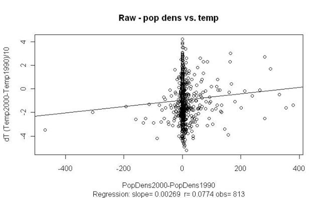
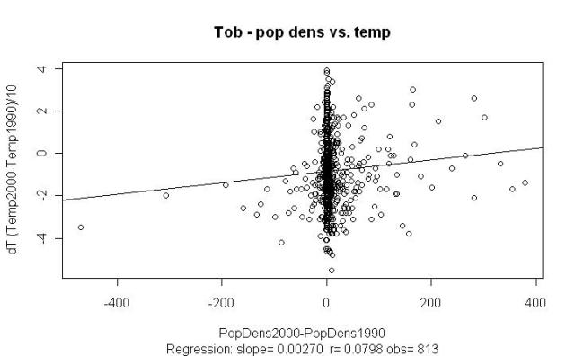
Anyhow, my first attempt approach was a simple one – I plotted the difference between station temperatures from 1990 to 2000 (based on yearly averages) vs. the difference in population densities from 1990 to 2000.

I thus only include stations that have data for both population density and yearly average temperature in 1990 and 2000. You’ll notice that the F52 plots have more stations because it extrapolates yearly average temperature data even when it is unavailable in the raw dataset. Anyhow, here we go:

There’s something there, but removing those outliers in the -200 region and beyond actually make the r value worse.

The dT is the trend per year, but in the temp data 6.47 is actually stored as 647, so our scale is hundredths of a degree per year the scale is tenths of a degree F. So if we’re to believe our slope from the F52 plot above, increasing the population density of a town by 50 people per km would result in a (50 * .002) / 100 = .001 degrees/year trend, or .01 degrees/decade trend 0.1 degrees F / decade trend.

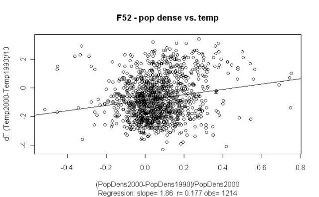
Endpoint temperature difference vs. endpoint population difference as a percentage of end year population density

Of course, we may expect the heating effect of increasing population density to diminish as we get a higher population density, so we’ll divide that population difference by the end year density. After all, going from 1 to 51 people per km would seem to affect the UHI more than going from 150 to 200 people per km.

Better r values, and I think the method is still defensible. If we believe the slope from F52 above, then we would expect that if 50% of our population density in a town has come within the last decade, it has contributed (0.5 * 1.86) / 100 * 10 = 0.093 degrees 0.93 degrees F to that decade trend.

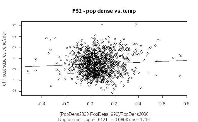
Linear temperature trend vs. endpoint population difference as a percentage

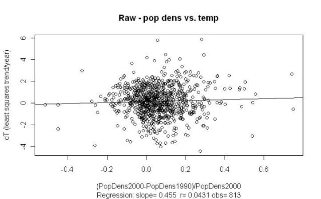
I implemented a simple least squares regression in Java to calculate the linear trend per year of temperature, since we have more data points than just the two end-points for that (unlike population density). I then used this as the Y value to plot against the population density difference:

I show two examples above because the F52 seems particularly sensitive to the outlier. If we’re to believe this last slope, then we would expect that if 50% of our population density in a town has come within the last decade, it has contributed (0.5 * .421) / 100 * 10 = 0.021 0.21 degrees F to that decade trend.

However, I’m a bit surprised by these last results (when using the OLS trend for the Y-value), and why the r values are considerably smaller than when simply using endpoint differences in temperature. I’m tempted to move on analyze different population densities (<10, >10 & < 100, > 100, etc.) using simply the endpoint temperature differences, but I’m not sure why theoretically this would be a better approach than using those OLS trends.

Is it incorrect to use those 9 in-between years of temperature data, when they are not available for population density? I could make the argument that if there was a population boom in the last year of a town, and this contributed considerably to the warming, that the endpoint difference would capture this better than the OLS trend, but can situations like these really account for such a difference across all the stations?

Update (8/8): It pays to read the README.txt file.  Apparently the reported temperatures are in tenths of degrees Fahrenheit, not hundredths of a degree Celsius.

Blog at WordPress.com.