…with charts galore. I’ve been looking at this as it folds into the ongoing discussion of inferring climate sensitivity from the radiation budget, although I don’t plan on putting much analysis into this post. It is more for visual reference.
The first three GIFs were generated using the Nino3.4 index (actual data from Climate Explorer), CERES TOA flux, and HadCRUTv4 gridded median from 2000 to 2011. The actual script and source images are available at http://dl.dropbox.com/u/9160367/Climate/4-30-12_Nino_Lag_Post.zip
Basically, these GIFs show the correlation between the Nino3.4 index and either local temperature, outgoing LW flux, and outgoing SW at different lags (with the Nino3.4 index leading these variables). Recall that the global surface temperature typically peaks about 2-4 months after the Nino3.4 index peak. Also recall that the Nino3.4 index is simply the sea surface temperature from 170W to 120W between 5N and 5S, so in those areas of the temperature grid we’re essentially correlating those local temperatures with themselves at 0 lag. Here we go:
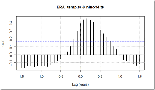
For a summary of the global picture, a while back I ran the cross correlation between these fluxes, temperatures, and the Nino3.4 index. ERA_temp.ts here refers to the t2m (tas) field in the ECMWF ERA-Interim reanalysis. As we can see here, the temperature peaks two months after Nino3.4:
In the shortwave case, there doesn’t seem to be much of a relationship between global SW and Nino3.4, and in fact there is a slightly better correlation with global temperatures. Oddly, the one month that is “significant” shows the decrease in outgoing SW flux leading a positive temperature changes by two months.
The OLR component, on the other hand, does appear to be better predicted using the Nino3.4 index than actual global surface temperatures.


