Troy's Scratchpad

October 28, 2011

Will 2011 be one of the top ten hottest years?

Filed under: Uncategorized — troyca @ 12:22 pm

Disclaimer: This post is for entertainment purposes only…no scientific value is suggested.

In a previous post on OHC GISS-ER model projections, Bob Tisdale pointed out a RealClimate post from earlier this year, in order to reconcile some differences between my graph and the one over there (Layman Lurker has suggested one possibility, the other possibility being that it is showing GISS-EH projections in the RC graph rather than GISS-ER).  And yet, the other tidbit from that RC post that piqued my interest is a prediction from Gavin Schmidt:

Consistent with that, I predict that 2011 will not be quite as warm as 2010, but it will still rank easily amongst the top ten warmest years of the historical record.

He stuck to his guns even when a commenter brought up the issue of La Nina, which I like.  

Anyhow, there was quite an interest over whether 2010 would set a record in all the major indices, and so in order to try and emulate some of that “temperature race” excitement from last year, I now have an excuse to show a new race – for tenth place in each of the major indices.

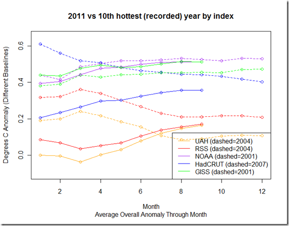
In the following graph, I have shown how the current temperature for the year is shaping up, versus that of the 10th hottest year in each of the major indices (they are different).  I have left each of the indices in their “native” reported baseline (which gives some separation), so this graph should NOT be used to compare the anomalies from one index against another.  Furthermore, the reason you notice more variability in the graph towards the beginning of the year versus the end is because the average is cumulative…so that the value for January shows the anomaly for January only, whereas the value for June shows the average anomaly for January through June.  The value for December is thus the average for all anomalies January through December, or the annual average.

So, how does the graph look through the first 9 months of the year?

Is2011TopTen

This year, GISS and UAH are currently on pace to be in the top 10, while HadCRUT, RSS, and NOAA are outside of it.

The GISS average anomaly for the remaining months would have to be below 0.36 C in order to avoid the top ten, and even though it is on a downswing (the September anomaly was 0.48 C), the strong La Nina from earlier in the year only dropped the temperature down to 0.43 C, so this will likely be in the top ten.

UAH would need to average below –0.06 C for three months to avoid the top ten (September anomaly was 0.29), which, even with the second part of the double-dip La Nina, would appear to be out of reach.

On the other hand, the satellite temperatures from RSS would require an average anomaly of 0.332 C to crawl INTO the top-ten, and even though this would seem feasible given the September anomaly (0.288), the fact that daily MSU temperatures have dropped significantly suggest that it will not beat out 2004 for tenth hottest.

NOAA needs to average 0.57 C to beat out its competition of 2001 for a place in the top ten, but with the recent posted anomaly of (0.52 C) being down from the previous months, it may be difficult.

And finally, HadCRUT, which just posted for September, needs to average .534 C over three months to crack the top ten (and beat 2007).  This also seems unlikely, given September’s drop down to .371 C. 

There you have it – with the hindsight of 3/4 of the year having reported, I would venture that GISS and UAH will be in the top ten, while NOAA, HadCRUT, and RSS will fall outside of it.  Of course, things may change.

Script available for this post here.

October 21, 2011

More on the effective ocean mixed layer on multi-year timescales, and Dessler 2011

Filed under: Uncategorized — troyca @ 6:42 pm

In a previous post on Dessler 2011, I commented that the paper had a few important errors within it, most notably an incorrect use of the ocean mixed layer heat capacity to show that the forcings from ocean heat transport dominated that of the unknown radiative forcings when it comes to surface temperature changes.  It has since been published,  In that previous posting I noted (although Dr. Spencer was there first) that Dessler 2011 incorrectly used the 700 meter layer (down to 750m) from the Argo data, which could be confirmed by downloading the Douglass and Knox data.  That fact has now been mentioned, with text explicitly added, in the published version:

“This can be confirmed by looking at the Argo ocean heat content data covering the top 750 m of the ocean over the period 2003–2008”.

I don’t want to go over the same ground as the previous post, but I will quickly note the following on why this is incorrect (slightly modifying one of my own comments from over at Bart’s):

The heat that ENSO distributes from the lower layers to the mixed layer is primarily what Dessler and Spencer are trying to estimate with with the “non-radiative” forcing. But the way Dessler has set it up, heat redistributed from  the 110-400 m layers to the mixed layer during ENSO is NOT counted towards this forcing, but heat redistributed from the 800 meter layer to the 700 meter layer (even though the 700 meter layer is uncorrelated with surface temperature changes) IS counted. Clearly, Dessler’s formulation is problematic.

SST_and_OceanT

The above image shows the relationship between the SST and the temperature measured by the floats at different depths for three-month anomalies (from 2000-2010).  As one can see, the top 100 meters or so show a positive relationship between SST and the temperature at those depths, whereas from 110 – 400 meters we see the opposite.  This is because during El Nino events, the heat leaves the 110m to 400m layer to make its way into the upper layers, and the opposite is true during La Nina events.  Clearly, beyond 400m, the heat lost or gained in those layers does not show much of a relationship with SST when it comes to seasonal variations.

There is, however, another method used by Dessler 2011 to estimate the monthly fluxes, which involves simply taking a set heat capacity (presumably the mixed layer) and multiplying it by the monthly fluctuations in SST:

To evaluate the magnitude of the first term, C(dTs/dt), I assume a heat capacity C of 168 W-month/m^2/K, the same value used by LC11 (as discussed below, SB11’s heat capacity is too small). The time derivative is estimated by subtracting each month’s global average ocean surface temperature from the previous month’s value.

The choice for this heat capacity is particularly important, given that Murphy and Forster 2010 used a similar method in their response to Spencer and Braswell 2008.  Science of Doom has been looking into this as well, and gives some background on the origins of why this is important related to the original Forster and Gregory topic.

So, why do we get such radically different results when using using 168 W-month/m^2/K times SST differences (~ 9 W/m^2 per month) versus actual measurements of the top 100 meters in Argo ( ~ 2 W/m^2 per month)?  Well, looking at the figure above, one reason should be fairly clear – a change in global SST does not result in a uniform change in all layers globally down to 100 m layer on these short time scales; the graph would show a regression coefficient of about 1 all the way to 100 meters if that is the case.  Since in fact the regression coefficient falls off pretty quickly after 50 meters (likely because parts of the globe don’t have a mixed layer depth deeper than 50 m), using a single constant heat capacity equivalent to 100 meters of water will overestimate the heat changes.

So, where does this 168 W-month/m^2/K come from?  In our conversation over at Bart’s, Eli Rabett notes the following:

Dessler and Lindzen and Choi, and Schwartz and etc.’s heat capacity of 168 W-month/m^2/K is the standard choice corresponding to a depth of ~ 100 m as you say. Everyone is Galileo

Which was helpful in that it led me to Schwartz 2007, who appears to be the originator.  In there, he notes:

The present analysis indicates that the effective heat capacity of the world ocean pertinent to climate change
on this multidecadal scale
may be taken as 14 ± 6 W yr m^-2 K^-1. The effective heat capacity determined in this way is equivalent to the heat capacity of 106 m of ocean water or, for ocean fractional area 0.71, the top 150 m of the world ocean. This effective heat capacity is thus comparable to the heat capacity of the ocean mixed layer.

The 168 appears to come from 14 W-yr/m^2/K * 12 months/year.  But the regression in S07 was performed to estimate the heat capacity on multi-decadal scales, when heat slowly moves into the deeper ocean, not merely the short-term monthly, seasonal, or even annual variations during 10 year periods!  Indeed, even Murphy and Forster 2010 note:

An appropriate depth for heat capacity depends on the length of the period over which Eq. (1) is being applied (Watterson 2000; Held et al. 2010).

But they seem to proceed with the 100m derived for a much longer period.  We can get this approximate 14 W-yr/m^2/K as follows:

Specific heat of water * mass per m^2 / seconds per year=

4.18 (J/g/K) * (1000 g/kg)  * (1000 kg / m^2) * (106 m depth) / [ (365.25 days/ year) * 24 (hrs/day) * (3600 s/day)]  = 14 W-yr/m^2/K

I’ll note a few things in passing: first, that 4.18 is technically for freshwater, not sea water.  Furthermore, at lower depths we start hitting some sea bottom, so the area fraction of the lower layers is not quite as large as that of the higher layers, although this should not make much of a difference in those first 110 meters.  However, most importantly, we see that multiplying the results of that 14 W-year/m^2/K regression by 12 and applying this to monthly values would assume that the heat capacity is the same for any length of period, and that annual change in energy would be about 12 times that of the monthly change in energy, which is simply not the case when you have the monthly and seasonal fluctuations up and down.  Indeed, using the outputs of ECHAM-MPI model (which will be free of the measurement noise that would affect short-term actual measurements), the three-month heat changes during the ENSO dominated periods are only about 2 times that of the single-month changes, and the  annual heat changes are only about 4 times that of single month changes.      

Since we’re interested in the seasonal and annual responses during a 10 year period (as in Forster and Gregory 2006 or Murphy et. al 2009),  we can use this most recent decade for a new regression.  Here I calculate a more relevant relationship between the diff of SST (dTs/dt) and the actual measure OHC flux (dH/dt) of the top 110 meters.  As seen below, we get a regression coefficient of  approximately 32 for the three month anomalies, which (if I’m not screwing this up) would theoretically correspond to about a 60m mixed layer depth appropriate for this time period (and indeed, on a monthly scale, 40m is more appropriate).


OHCFlux_and_SSTDiff

All of this ignores the fact that there are likely to be measurement errors within the ocean temperatures as well, and that, at one month, those errors will affect the average more than 3 months, and certainly more than a year.  In discussions over at Isaac Held’s place, it’s becoming clearer to me – based on model estimates of that regression coefficient – that using monthly anomalies are not effective for calculating the feedbacks, and that we’ll probably need to look more at annual fluxes to reduce the noise (both measurement and atmospheric) when calculating that sensitivity.  On those time scales, at least according to Dr. Spencer’s recent post, it appears that the “unknown” radiative forcing can contribute 60% of the forcing necessary for the ocean heat changes. 

Taking a look at the control runs in Dessler 2011 (figure 2) at 0 lag, the models seem to show an average coefficient of around 0.5, which corresponds to a sensitivity per doubling of CO2 of about (3.8/0.5) = 7.6 C, when in fact we know the average sensitivity in those models are around 3 C.  This would suggest that the method of Murphy et al. 2009 and Forster and Gregory 2006 using seasonal anomalies (of flux vs temp changes) shows no linear relationship with the actual sensitivity, or, if there is a relationship, it is a severe overestimate (applying this to the results from observations, correcting for such a theoretical underestimate would yield an ECS of ~ 1.3 C per doubling of CO2, not even accounting for underestimate caused by the issues in SB08/SB1).  However, I tend to think that it is not an accurate way to diagnose feedback, as many of the regression coefficients are near 0. What remains to be seen is if using annual anomalies of TOA flux and temperature changes will yield better estimates.

Code and data to reproduce the figure available here.

October 13, 2011

GISS-ER Ocean Heat Content, 20th Century Experiment and A1B projections

Filed under: Uncategorized — troyca @ 12:43 pm

In my first post on GISS-ER Ocean Heat Content projections, Bob Tisdale asked me if I could show the hindcast data as well.  This included 9 runs of GISS-ER for the 20th century experiment, which I then downloaded and processed in the same way I mentioned in that previous post.  Also, since the model runs actually spit out absolute temperatures, it’s possible to baseline even the projections – which start in 2003 – to the 1955 through 1998 period of overlap between the NODC observations and the 20th century hindcasts.  As I mentioned in that last post, these calculations have a few simplifying assumptions and should not be taken as perfect, but the method certainly tracks extremely well with Levitus OHC calculations (r^2=.998).   You’ll also notice that there is a gap from where the 20th century experiment ends and the A1B projections begin, between 1999 and 2003.


I must say, on first glance, this seems to vindicate Bob’s post that received so much flak for showing the GISS-ER and the NODC trends starting at the same point in 2003, as his choice would seem to be a better representation of the quantity of “missing heat” between the model projection and the observations.

All code and intermediate data is available from here.  Raw ThetaO data for the CMIP3 model runs available from PCMDI.  Observational data available from NOAA NODC.

Update (10/13): I noticed that I didn’t mention that this is ONLY for the top 700 meters, in line with what I’ve been looking at in the past few posts.  I’ve updated the image to include that note.

October 11, 2011

ECHAM-MPI model runs, Ocean Heat Content, and Katsman and van Oldenborgh 2011

Filed under: Uncategorized — troyca @ 7:37 am

As I mentioned in my last post, the GISS-ER projections for ocean heat content did not seem to include any period of flattening like we’ve seen between 2003 and the present, so I wanted to see if some other CMIP3 models might include the variability in upper ocean heat content to explain such observations.  Over at Real Climate, Dr. van Oldenborgh mentioned that his paper (I’ll call it KO2011 from here on out) used 17 runs from ECHAM-MPI to explain the current flattening.  The three key points for the paper listed at GRL are:

  • An 8-yr period without upper ocean warming is not exceptional
  • It is explained by more radiation to space (45%) and deep ocean warming (35%)
  • Recently-observed changes point to an upcoming resumption of upper ocean warming

First, I will note that the projections (these start in 2001) for the upper 700m DO seem to show more variability than GISS-ER, (despite there only being 2 for the SRESA1B scenario at PCMDI) which is a good thing when it comes to explaining the recent flattening:

ECHAM-MPIvsNOAA_SRESA1B

I’ve once again baselined to the overlapping years, which now starts in 2001.  As you can see, it still seems like ECHAM-MPI has difficulty reproducing the variability, but it is not quite as monotonic as GISS-ER. 

However, while the Katsman and van Oldenborgh paper does some interesting analysis with respect to deep ocean warming and the model simulations, there are a few problems with it that lead me to question those three key points. 

Issue #1 – A Statistical Problem of Independence

In KO11, they use 17 different runs, and then calculate all of the different overlapping 8-yr trends during the period for each of the runs, yielding their following conclusions:

From the distribution of linear trends in UOHC, it appears that 11% of all overlapping 8-yr periods in the time frame 1969–1999 have a zero or negative UOHC trend (Figure 2a). Over 1990–2020, around the time of the observed flattening, this is reduced to 3% (Figure 2b), corresponding to a probability of 57% of at least one zero or negative
8-yr trend in this time frame.

Bold mine.  The 3% actually appears to be rounded up from 2.66%, which is calculated by 14 of these overlapping 8-year trends from "17 members × 31 overlapping 8-yr periods = 527 trend values" having seen a trend of 0 or negative.  The 57% percent could then be calculated based on the probability that 31 of the non-events do NOT occur, or 1- (1 – .0266)^31 = 57%.  Clearly, there appears to be a problem.  These event are treated as independent, when clearly the fact that the trends are from overlapping periods means there will be high amounts of autocorrelation (quite separate from year-to-year OHC exhibiting autocorrelation).  In other words, it ignores the fact that a particular ensemble member containing one negative 8-year trend is more likely to have another 8-year trend (particularly if 7 of those years are overlapping) that is negative, so that the probability of any particular run having "at least one zero or negative 8-yr trend in this time frame" is actually substantially less than that 57%.

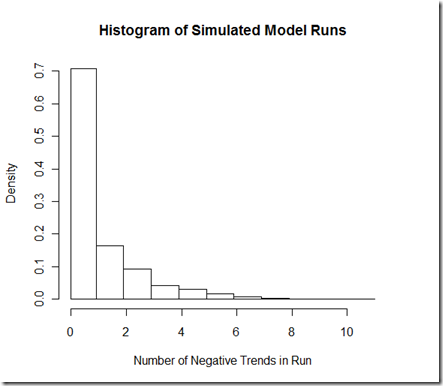
The degree to which it is different I believe depends largely on the autocorrelation/noise model.  I’ve used a ARIMA(2,0,2) for the noise, which I got as a "best fit" from one of the ECHAM-MPI runs, and added in a trend for this simulation.  I’ve tuned to model to give approximately the 2.66% negative trends presented in the paper.  Anyhow, running the simulation 1000 times yields 797 negative 8-yr trends out of (1000 runs * 31 8-yr periods) or 2.57% of the trends are negative.  By the logic in KO11, we should expect that there is a 55% chance [1-(1-.0257)^31] that we’d see a negative trend over any given run.  However, if we look at our simulation, only 36% (362 out of 1000) of the runs actually contain the negative trend.  A look at our histogram below shows why:
HistogramOfRuns

Out of the 362 runs that contain at least one negative trend, a whopping 197 of them contain 2 or more negative trends, far more than we would expect if they were independent trials, but quite what we’d expect with these overlapping periods. 

But really, much of this extra simulation is unnecessary.  A look at figure 2b seems to show (if I’m reading the colors correctly) that 5 out of the 17 ensemble members during this period show a zero or negative trend, or 29%.  Yes, this is a smaller sample size, but if KO11 had simply reported this they would have avoided this statistical pitfall, and the 29% is almost certainly a more correct figure than the 57%.  Figure 2B from KO11 (each color represents a different member of the ensemble):

KO11_Fig2b

Does this issue "matter"?  On the one hand, I would argue that yes, it matters if the probability of this happening over the 31-year period is more likely than not (57%) vs. less than a 1 in 3 shot.  On the other hand, using a length of 31 years to diagnose whether an 8-yr event is "exceptional" seems rather arbitrary, particularly when it happened right after the SRES projections began.  Furthermore, why KO11 also prominently included the 1969-1999 centered 8-year trends (which includes 1966 as the first year) is a mystery to me, given that the change in anthropogenic forcings used for the model over that period do not resemble the magnitude present in estimates for the 2003-2010 period.  I’m not quite sure how to interpret the "not exceptional" part: certainly, if I can choose a model with some of the highest variability, choose a length of time for the event to happen, and/or choose a period with a smaller increase in forcings, then run this model numerous times, it seems possible that the event may occur with likelihood over that period.  When it comes to examining the CMIP3 models as a whole, I might ask what percentage of the ensemble members showed an OHC trend resembling that 2003-2010 period?  I won’t know until I process all the different runs for the different models.

Issue #2 – The ENSO observations do not bear out the theory

From KO11, under the "Recent Absence of Ocean Warming" section, we read:

During 2002–2007, a series of El Niño events occurred (www.cpc.noaa.gov/data/indices/), which probably yielded a larger than average upper ocean heat loss [Trenberth et al., 2002] caused by the (lagged) response through net outgoing TOA radiation (Figure 3b). This seems at odds with direct observations that indicate an opposing increase in the radiation from space [Trenberth and Fasullo, 2010], but the record has large uncertainties and is too short to separate trends from decadal variability.

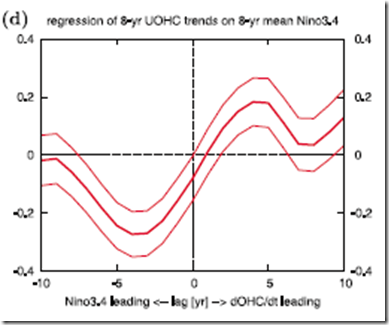
KO11 readily admit that the TOA radiation observations do not match the behavior in the models that explain the flattening of UOHC, but chalk this up to uncertainties and a short record.  That’s fine.  But the comment about 2002-2007 "El Nino events" seems to make little sense given the theory that has been established throughout the paper.  Basically, KO11 show that in the model simulations, El Nino events result in a heat loss that leads to a decrease in the ocean heat content trend in subsequent years, whereas La Ninas have the opposite effect (heat gain) and lead to an increase in the OHC trend.  A very specific lagged correlation is shown between the mean Nino3.4 index over an 8-year interval and the 8-year OHC trend in figure 3d:
KO11_Fig3d

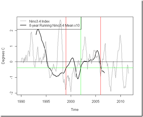
According to the graph of theory/model simulations, the OHC trend from 2003-2010 would be driven by the mean 8-year Nino3.4 index from 4 years prior, or 1999-2006 (that is, the running mean centered on 2002).  Below, I’ve shown the Nino3.4, with this relevant portion highlighted:
NinoRunningMean

The two red lines bound the ENSO period we’re talking about, and the green lines point to the specific point in the running mean that would be relevant according to the theory.  Note that in 2002 it is actually BELOW 0, closer to La Nina conditions, which is the opposite of the strong decadal El Nino (positive Nino3.4 index) that the theory projected would have caused such a flattening!  Yes, we see El Ninos between 2002-2007, but we also see a lot of fluctuations in the opposite direction…that’s the nature of ENSO.  However, unless I’ve missed something (which is quite possible), or the chart is unclear, I cannot see how the combination of the flattening OHC trend and the observed Nino3.4 is at all consistent with the model findings, and in fact seems to contradict them. 

So does this issue matter?  In this case, I think the answer is “yes”.  The current OHC trend would seem to be exceptional according to the model, if we experienced it without the corresponding ENSO variation that would have been expected to cause the extra 45% heat to radiate to space.  Furthermore, the  projection of an “upcoming resumption of upper ocean warming” depends largely on the shift in ENSO to La Nina conditions, but, as we’ve seen, the La Nina conditions already were present 4 years prior to the current flattening.  If I had to bet, I would bet that OHC warming indeed picks up again, but this particular attribution to ENSO does not seem to have much observational support.

Anyhow, all code and intermediate data for this post can be found here.
October 6, 2011

GISS-ER and Ocean Heat Content

Filed under: Uncategorized — troyca @ 7:47 am

A while back, there was quite a “kerfluffle” (as Lucia called it) regarding the comparisons between the GISS model projections for Ocean Heat Content (OHC) and those calculated by NODC.  However, the thing that struck me at the time was that I could not easily find any available averages for the 700 m OHC projections for any of the model runs.  If I recall correctly, RealClimate, Tamino, and Bob Tisdale were simply using linear extrapolations.

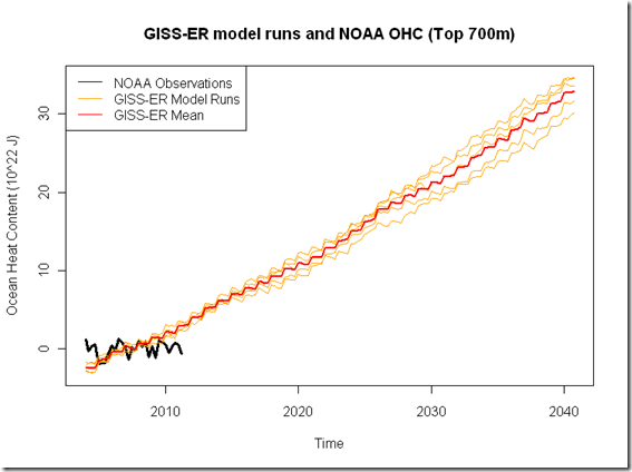
Since recently I had been doing my own OHC calculations from the NOAA/NODC data, I decided I would register for an account at PCMDI, download the gridded ocean potential temperature data, and perform the averaging myself to derive estimates of OHC for some model projections.  Today, I will be showing the five runs from GISS-ER under the SRESA1B scenario (720 ppm stabilization) from CMIP3.  I’d also like to do GISS-EH, but those files are a lot bigger, and taking longer to download and process.  I’m assuming they have a higher resolution.

Anyhow, the package that includes the data and scripts mentioned in this post is available here.  There are a few points I want to note:

  1. I convert from average temperature to Ocean Heat Content simply by multiplying by a factor (specific heat * volume * density) which assumes a constant value for all of those as we increase depth, which is not strictly accurate.  However, as we saw in that previous post on OHC, the results are pretty darned close (r^2 = .998 between my NODC calculations and that available from Climate Explorer), and I will be using my calculated values from observations to compare against my calculations from the projections, so it will be more of an apples-to-apples comparison, even if the factor is slightly off.
  2. I start everything in 2004, because that is when the GISS-ER projections start for the SRESA1B scenario.  I have baseline everything to the overlapping period…that is, 1st quarter of 2004 through the 2nd quarter of 2011.
  3. If you want to personally do a more in-depth conversion from layer temperatures to OHC, I have also included the intermediate calculations of globally-averaged ocean potential temperatures for the top 16 layers (down to 700m).

Anyhow, here is the comparison between the 5 GISS-ER model runs and the observations:

GISS-ER_vsNOAA_OHC

For kicks, I would note that the simple OLS trend for the overlapping period is  0.089 +/- 0.163 J*10^22/year for the observations, compared  to the 0.715 +/- .054  J * 10^22/year for the model mean.  On the one hand, I’ll note that this is a short period, and there are some other things – such as a prolonged solar minimum – taking place here.  On the other hand, I’d like to point out that calculating the smallest trend over ANY 7.5 year period in the runs of the chart above yields the following results:

Run1: 0.673 J * 10^22/year
Run2: 0.714 J * 10^22/year
Run3: 0.583 J * 10^22/year
Run4: 0.555 J * 10^22/year
Run5: 0.633 J * 10^22/year

So, the smallest trend for any 7.5 year period in the 36 years for any of the five runs is 0.555 J*10^22/year, which is clearly much larger than our currently observed value.  I’ll need to take a look at Meehl et. al 2011, and there are certainly other models, but it seems to me – at least at initial glance – that there is nothing in the GISS-ER runs to suggest that we could potentially see a slow-down in the OHC of the upper 700 meters that we are currently seeing.  I’d welcome other opinions.

October 3, 2011

Quick update on lag between SST and AMSU 600 mb with daily data

Filed under: Uncategorized — troyca @ 6:57 pm

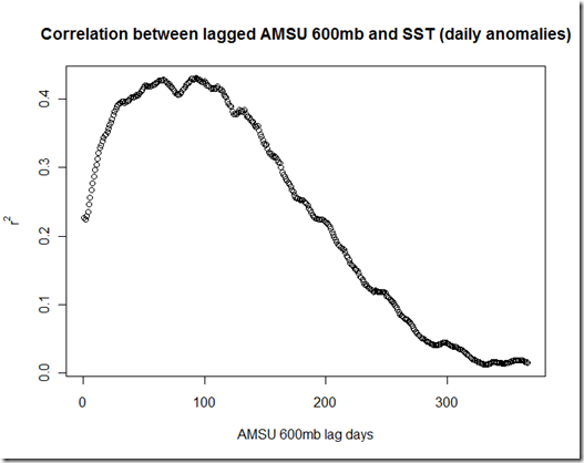
The lag between SST and TLT was discussed here, as it would seem to have important consequences when trying to estimate the overall climate feedback (and hence sensitivity) from surface temperatures.  Here I present the estimates of lag time using the SST and 600mb AMSU data available from the UAH Discover website.  The script is available here

Anyhow, here is a plot of the daily anomalies:

SST_CH5_Anomalies

Clearly, there is a lag between the peaks of SST and those of the atmospheric temperatures at the 600 mb layer, which is also confirmed with the chart below (as you might recall, 1-3 months was our estimate from TLT vs. SST, but at this layer it could be even close to 4 months):

SST_CH5_Correlation_Anomalies

For those interested in what these graphs would look like if we did not center based on daily values, and left the annual cycle in there instead, here’s what we get:

SST_CH5_WithSeason

SST_CH5_Correlations_Absolute

Blog at WordPress.com.