I recently started a small library of functions I use frequently to process downloaded CMIP5 runs on Github. Additionally, there are some processed files I uploaded to that repository, which are the monthly global tas (surface air temperature) text files for a large fraction of available CMIP5 runs.
In order to put these to use, I thought it would be interesting to investigate where the “observed” temperature trend appears relative to all CMIP5 runs for every combination of start and end years from the last half of the 20th century (1950) to present (2013). Thus, below I show the “percentiles”, where red values indicate the observed temperature trend is running hot relative to the models (75th percentile means the observed trend is larger than 75% of the model runs over that same period), and blue indicates the observed temperature trend is running cool relative to the models.
The list of models included can be found here. In order to avoid too strongly overweighting certain models relative to others, I have restricted the number of runs to include per model to a maximum of 5. The temperature observations come from the Cowtan and Way (2014) kriging of HadCRUTv4. Here is the result if we look at all trends over this period that span 15 years or more:
From a glance, it appears that there is a good deal more blue than red here, suggesting that a lot of the observed trends are running towards the cooler end of models. Some recent papers (eg. Risbey et al (2014) ) have been looking at the “hiatus”, and in particular 15 year trends, arguing that the most recent low 15 year trend doesn’t necessarily provide evidence of oversensitive CMIP5 models because these models cannot be expected to simulate the exact phasing of natural variation. They point out that at points in the past, the observed 15 year trends have been larger than that of the models. There is some support for that in the above graph, as shorter trends ending around 1970 or in the 1990s tended to be towards the higher end of model runs. Moreover, I think that anybody suggesting that the difference between observed and modeled trends during the “hiatus” was due solely to oversensitivity in models is misguided.
That being said, I think if we move past the “models are wrong” vs. “models are right” dichotomy and onto the “adult” question of “are models, on average, too sensitive in their transient responses?” we can agree on the following: given the apparent large contribution of internal variability to 15 year trends, seeing these observed trends in both the upper and lower percentiles of modeled trends is to be expected, even if models on average were too sensitive in the transient by, say, 35%. In the case of models being too sensitive, we would simply expect to see more trends in the lower percentiles than higher percentiles, as above.
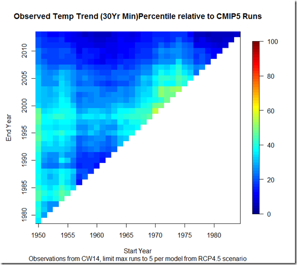
However, I think a more striking picture emerges if we look at only 30-year or longer trends, where some of the higher frequency variations are filtered out:
Here, we see that depending on start and end year picked, the observed trends generally fluctuate between the 2nd and 50th percentiles of model runs. This seems to be strong evidence that the CMIP5 runs are, on average, running too hot. Otherwise, one might expect the observed trends to fluctuate more evenly above and below the 50th percentile. Whether they are running too hot because of incorrect forcings or oversensitivity cannot be divined from the above figure, but I think it provides stronger evidence that the models are running warm than the single most recent 15-year period.
Script available here.

